
I may eventually say the same thing for all the two-layer, two-color warping configurations; I don’t use them often, but it’s useful to know how to do them when you want them. This one is probably my least favorite warping configuration which is interesting to me because it’s the same configuration generally used on a rigid heddle loom—warp one color, weft another. If you want to practice a weaving pattern you have in mind for a rigid heddle project, this pin loom warping configuration should be useful for that—especially if every odd row in your RH project is plain weave.
In all my years weaving I think I’ve only used this warping configuration once before tonight, but I could be wrong. In the green-and-white finished sample square you can see the interesting effect, along the top and bottom, of changing colors L2-only, so I’d say this configuration is worth exploring.
Read More →
It’s not often I find the need to change colors on layer 3 (L3). In fact, I’ve avoided it. However, this week I stumbled across an effect that showed up only on the back (in the L1 warps) of a square I wove. In order to get it to show up on the front I needed to change colors on L3 (and redesign the pattern).

Front and back of square
WARPING THE LOOM FOR COLOR CHANGE AFTER L1

Lay in the warp for L1 only. Note yarn twist at Cr1 (illustrated in the previous post). Keep reverse slip knot (RSK) near Cr3 loose. Tie off L1 outside 2-4 edge pins at Cr4.
It’s ridiculous to keep writing the same information over and over, but it seems sensible to have a series of two-color weaving posts in consecutive order on this blog. The information in this post is reprinted and slightly updated from a post previously published on Windsweptmind.com. If you want basic information on changing colors for layer 4 (L4) only, visit that post.
This series addresses changing colors and …
Working in Ends As You Go Read More →
Let’s say you want to design a weaving pattern but don’t know how to go about it. First let’s decide what kind of pattern you want to design—a textured pattern or a figure (e.g. heart, diamond…).

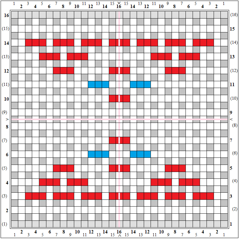
Single Heart Outline, Solid Heart, Cross My Heart 3
(for Amelia in Korea—thank you for asking!)
- Why do pin loomers use three-layer warping?
- Is it stronger?
- What are the differences between 1-, 2-, and 3-layer warping?
- How do we decide which warping method to use?

a small selection of Weave-It looms and squares
First of all—and this is easy to overlook; I often make the l-to-r mistake when I forget to pay attention to what I’m doing—READ ROW INSTRUCTIONS LEFT-TO-RIGHT ON EVEN ROWS, RIGHT-TO-LEFT ON ODD ROWS.
These colors usually appear only on three-layer warp (3LW) patterns:
Red = UNDER
Blue = OVER
White or Gray = PLAIN weave
Green = optional Under
Light Blue = optional Over — not used very often
Here are some examples:
Star Valley